

Color 101- A Designer's Perspective on Color
Color says it all. It sets the tone, creates emotion, and can have the most impactful effect in a room. Color can be inviting and warm, loud and energetic, or calming and cool. When designing a space, lots of colors can come into play and it’s important to be able to blend the right colors together to create the vibe you are aiming for.
My goal through this blog is to help you understand the emotions behind specific colors, the impacts they can have, and how to apply color within your spaces in a way that helps you meet your design goals. So lets get started!
Color Emotion and Psychology
Color psychology involves the study of how certain colors impact human behaviors and emotional responses. One of the most common places we see this science occur is in the food industry through the branding and atmosphere created within their dining areas. For instance, when you think of fast food chains, the color red is often used. Why you might ask? The color red has been found to often lead to impulsive and dynamic behavior. Fast food chains want to imply a feeling of quick and convenient pleasure and what better way to do it than surrounding you with colors that are more likely to invoke those responses and make you want to eat there.
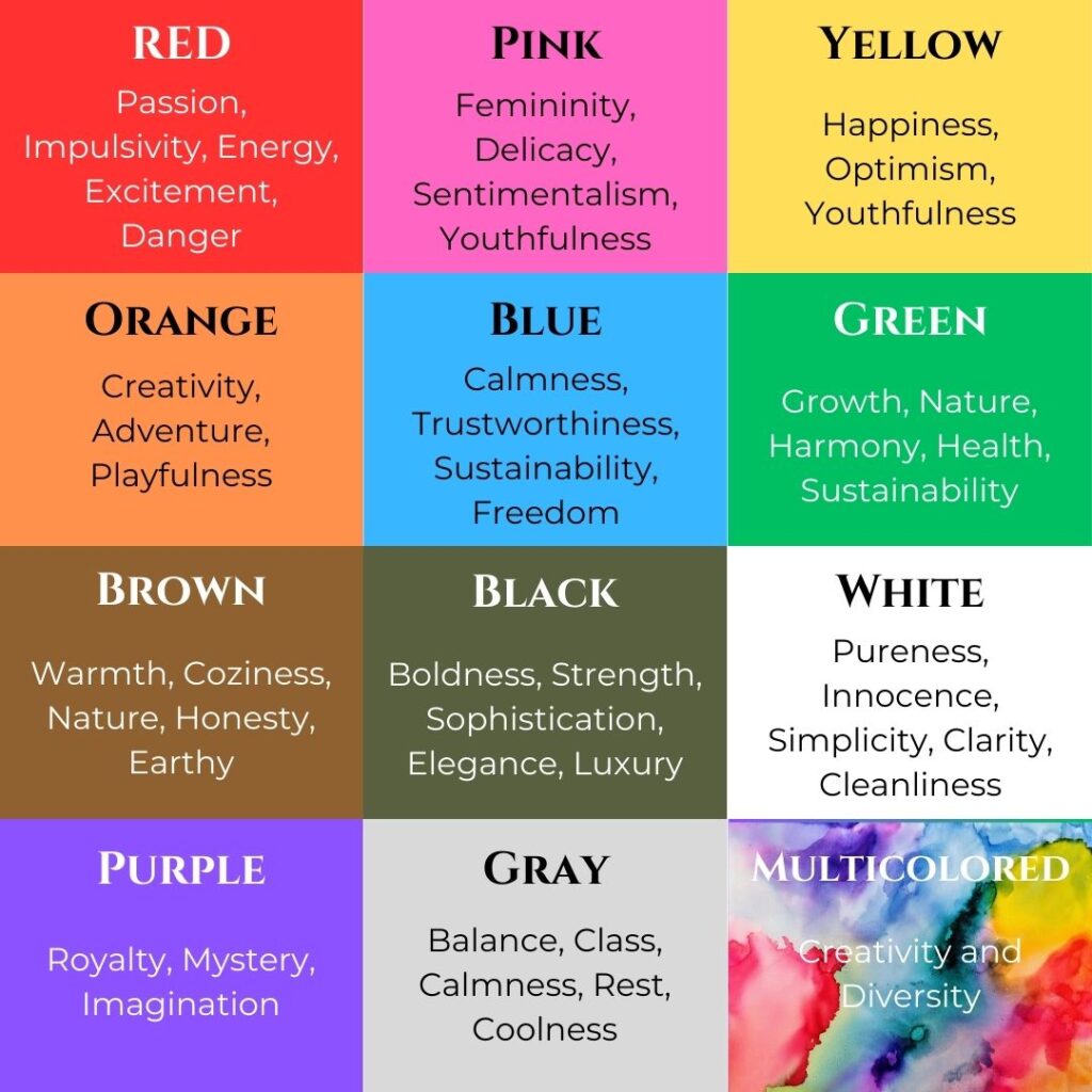
So with that being said, let’s break these basic colors and their psychological responses down:
· Red- can invoke a sense of passion, impulsivity, energy, excitement, and even danger
· Pink- can invoke a sense of femininity, delicacy, sentimentalism, and youthfulness
· Yellow- can invoke a sense of happiness, optimism, and playfulness
· Orange- can invoke a sense of creativity, adventure, and playfulness
· Blue- can invoke calmness, trustworthiness, sustainability, and even a sense of freedom
· Green- can invoke a sense of growth, nature, harmony, health, and sustainability
· Brown- can invoke a sense of warmth, coziness, nature, honesty, and a down to earth feeling
· Black- can invoke a sense of boldness, strength, sophistication, elegance, and luxury
· White- can invoke a sense of pureness, cleanliness innocence, simplicity, and clarity
· Purple- can invoke a sense of royalty, mystery, and imagination
· Gray- can invoke a sense of balance, class, calmness, and rest
· Multicolored- can invoke a sense of creativity and diversity
Now that we can see what emotions can be created by just a single color, let’s delve into how colors can impact the rooms within our home:
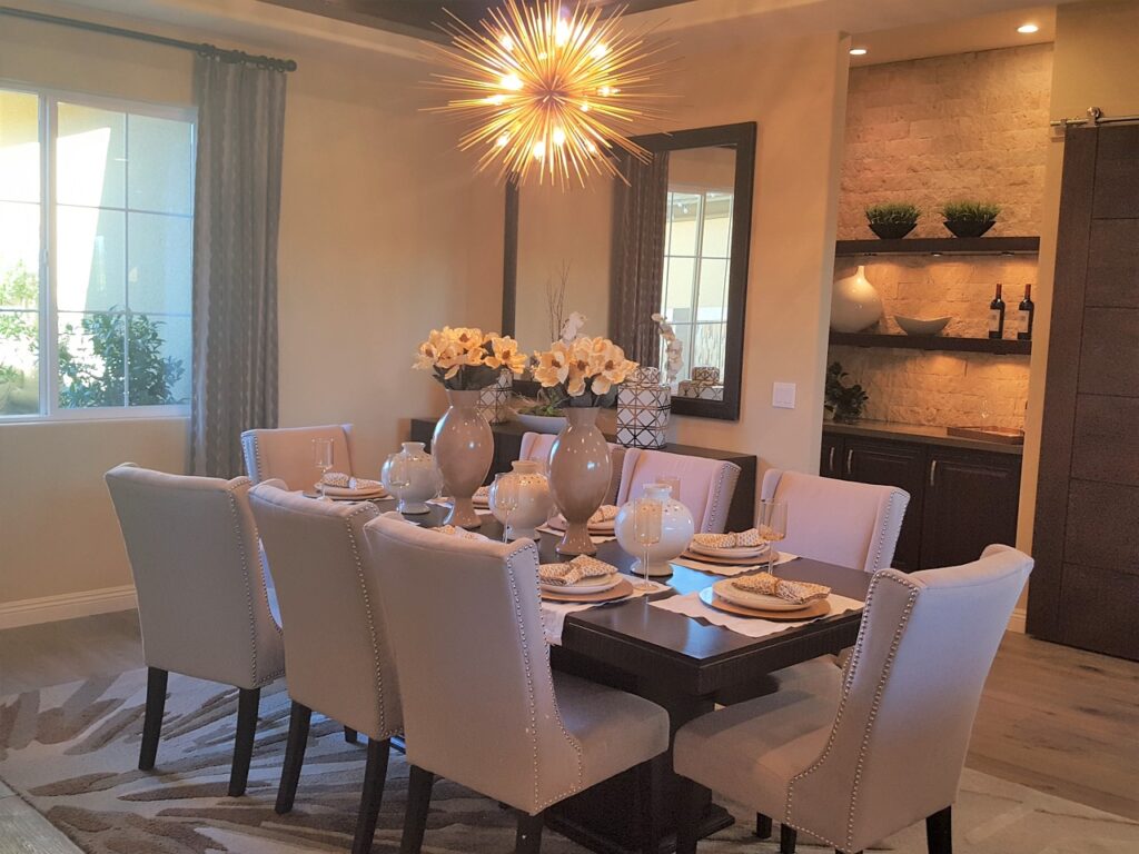
· The Dining Room- the dining room is a place where people gather and share a meal, catch up with one another, and develop connection. If you want your dining room to be a place of energy, stimulation, excitement, adding nice hints of red, oranges, and yellows would probably be your best bet. However, for those who might already have a rowdy or exciting crowd, a nice shade of green, light shade of brown, or even some creamy whites can create a more serene, laid-back atmosphere. (Think of a fancy restaurant dining room vs a coffee shop – one creates appetite and energy, the other creates calmness and satisfaction and makes you want to stay and rest for a while.) Black is another color that is used to create sophistication or a more romantic feeling in a dining room but should be done in moderation so as to not overpower the room and make it feel too dark or restrictive (think of classic black and white with hints of red). One color that is often not recommended for dining rooms is blue as it is known to actually suppress appetite and can cause drowsiness, so if you want to incorporate blue, make sure you do so in very light moderation.
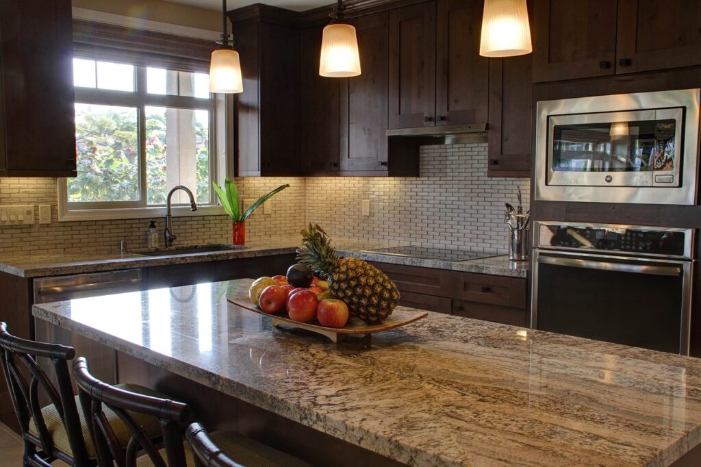
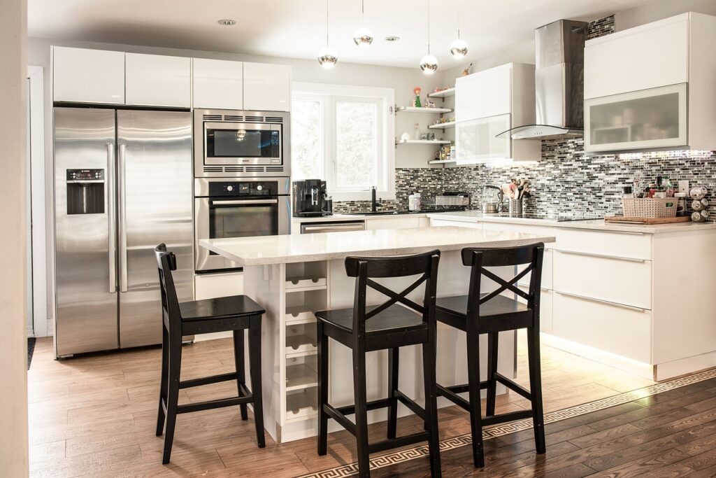
· Kitchen- The kitchen is often the most used room in the house and is often used for various occasions and reasons, making the choice of color probably the hardest yet most important amongst all other rooms. Many people often choose white in a kitchen as it creates a clean, bright feel, and brings energy to the users as well. For those early morning chefs, white will wake you up and help you get your day started. Another color often used in the kitchen is a light shade of gray. It creates a more neutral atmosphere and can be flexible in its effect of being colder or warmer based on the accessories added with it. If you are wanting a warmer more sophisticated feel, choosing darker colors in your cabinetry and countertops can increase that feel. If you’re going for a more earthy, healthy, sustainable and clean feel, a mix of greens, browns, and earthy tones are perfect for a kitchen. Blue can be challenging in a kitchen but if done in moderation and with other colors, it can create a serene and clean feeling atmosphere. Last but not least, like the dining room, if you are looking for a more bold, moody, or exciting atmosphere, reds and yellows as well as hints of black can help bring those emotions to your kitchen as well.
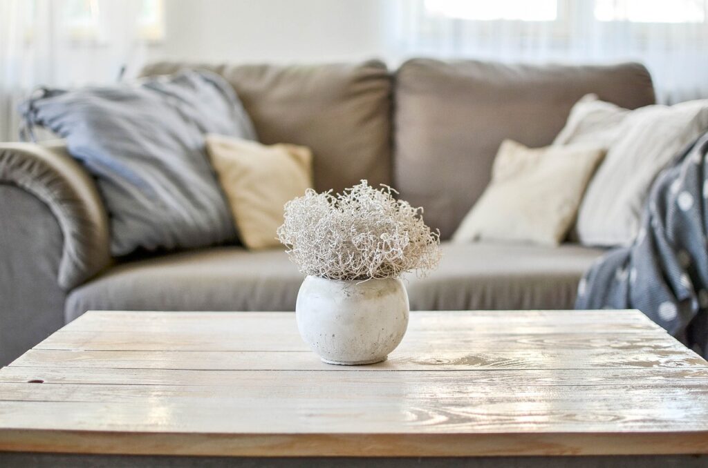
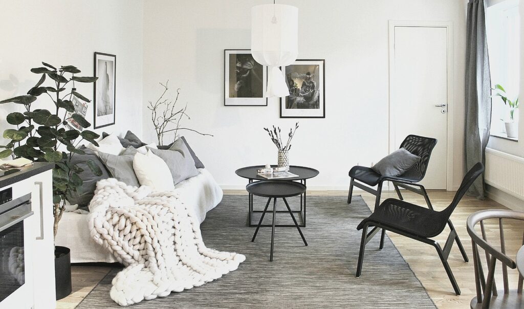
· The Living Room- When it comes to the living room, most of the time an atmosphere of relaxation, warmth, and coziness is desired and that is why the most common colors used are blues, greens, grays, creamy whites and browns. Of course, the key to making these colors work is to use them in moderation and balance which we will discuss here very soon. If you are choosing a color palette for a more sophisticated or minimalist style living room, black and white as well as dark and natural wood tones can help.
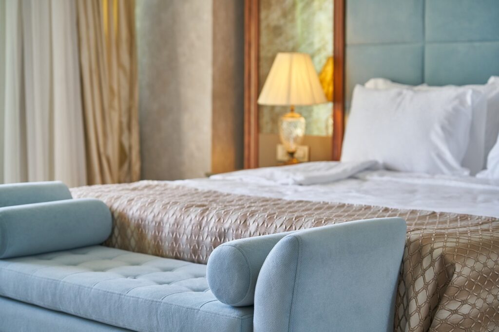
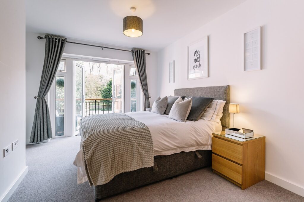
· Bedrooms- From my perspective, blue is one of the safest colors for a bedroom. It’s a restful color and can create a sense of peace. Green is another color that is often used, as it is considered a “grounding” color that also can promote serenity and calmness (and actually has been proven to prevent nightmares as well). Of course, both of these colors can also be dialed up or down based on their tones which is why we often see richer, brighter shades in children’s rooms where a more energetic vibe is created vs in an adult’s room where a harmonious feel is desired. Other colors that are often used include warmer, earth toned browns (think greige and tans) as well as grays and creamy whites accented with lots of textured elements throughout the room. In kids’ rooms, we often see all kinds of colors that represent the child’s individual personality, but it is important to remember that in choosing a color for their bedrooms, we are not creating an atmosphere that is too energetic or bright to promote rest and sleep. It’s best to save those exciting, bright colors for the playroom.
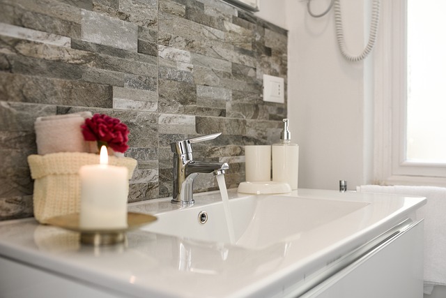
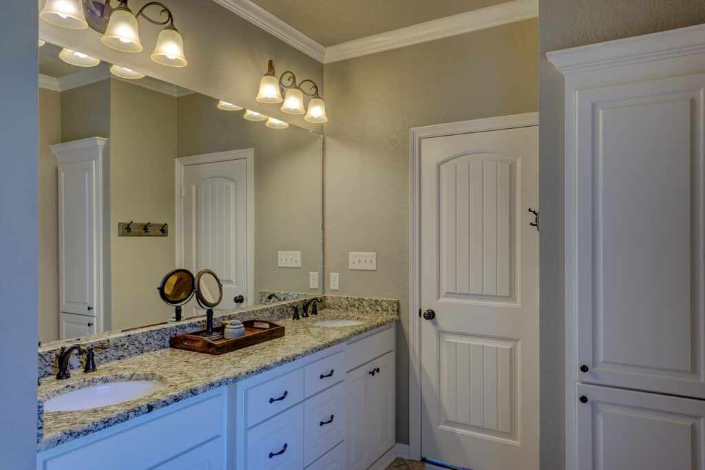
· Bathrooms- Blue and green are again very popular colors in bathrooms as they creates a natural, clean, and calming spa-like atmosphere. White and Gray are also often used as well to promote cleanliness, but should be accented with some greens, and light, earth toned colors so the room does not begin to feel too sterile and cold. Colors I try to avoid in the bathroom are yellows, reds, and oranges. If a darker brown color is desired, I try to incorporate it through the cabinetry or flooring. I also often use black hardware to add sophistication and a modern touch.
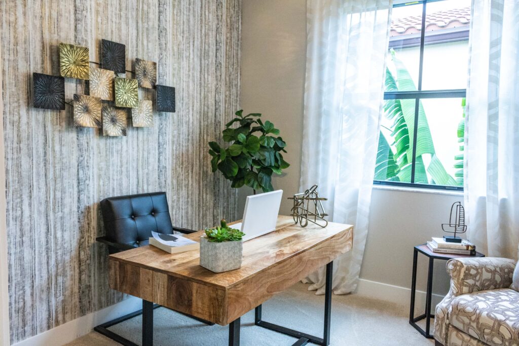
· Home Offices- Yellows, greens, blues, and creamy neutrals are often the most popular colors in home offices as they help in promoting productivity and avoiding overstimulation and stress. It is important to not let any “one” of these colors overtake the room though so as to avoid too much of any given emotion. Offices are a place where productivity and focus is often needed so it’s important to choose colors that will promote these emotions.
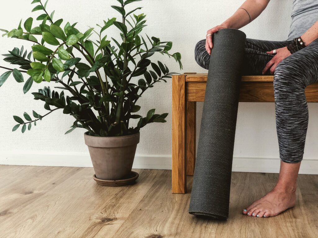
· Home Gyms/ Workout Rooms- Based on your preferred workout style, you will want to choose a color that promotes the energy that goes with it. For instance, bright oranges, reds, and yellows create energetic and loud atmospheres (best for power lifting, cross-fit, etc.) whereas a routine that involves more relaxation techniques would be more suitable for earth toned, clean colors, like white, green, blue, browns and even lighter pinks (think yoga, pilates, etc.).
When choosing the right color for each room in your home, it all boils down to moderation and the emotion you are trying to create within each room. You do not want to overpower your room with just one color, but rather balance out a select color palette of about 3 differing colors throughout the entire room. When choosing a palette for a room, I often follow a 60-30-10 rule:
· 60% of the dominant color (based on the main emotion you are trying to invoke)- often placed on the wall itself
· 30% of the secondary color (adds visual interest and contrast to the room) – often done through the bigger furnishings as well as window treatments
· 10% of the accent color (allows the eye to rest and creates a cohesive finish in the room)- often done through accessories throughout the space
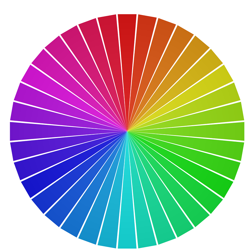
In following this rule, it is best to use contrasting colors (those opposite of each other on the color wheel) to create balance. For instance, if your main color is red, don’t choose your secondary color as orange, but maybe a green or blue. I also personally, like to use some kind of neutral in every space I design as it allows a “base” or background to avoid clashing of too many colors.
Hopefully by reading this blog, you have learned a few tips and tricks you can apply in your space. It’s important to remember in redesigning your space to keep true to your own tastes and preferences. If you are staging, I always recommend going for a more neutral look that matches the style of the house and area around it so you can appeal to the most potential buyers as possible. Not everyone has the same taste and by choosing neutral colors with light accents, buyers can easier visualize how to incorporate their own palette within the space.
As always, never be afraid or hesitant to ask for help. Color is tricky, even for designers sometimes, but by working together in defining your specific desired color palette, we can help you in creating the environment you desire within your home.
*Disclaimer: The content within this article is to be used for general informational purposes only and is not to be substituted for professional expertise. Sydney Kaitlynn Interiors, LLC will not be liable for any errors or omissions within these articles or through any external links provided and will not be held responsible for any losses, injuries, or damages sustained from the display or use of the information therein.